Digital marketing success hinges on the ability to transform website visitors into paying customers, yet countless businesses struggle with disappointing conversion rates despite driving substantial traffic. The gap between visitor engagement and actual conversions often stems from preventable mistakes that sabotage the customer journey at critical touchpoints. Understanding these conversion killers becomes essential for any organisation seeking to maximise their return on investment and achieve sustainable growth in an increasingly competitive digital landscape.
Modern consumers expect seamless, intuitive experiences across all digital touchpoints, and even minor friction points can derail potential conversions. Research indicates that the average conversion rate across industries hovers around 2-3%, meaning that 97-98% of visitors leave without taking any meaningful action. This statistic reveals enormous untapped potential that most businesses overlook due to fundamental design, strategy, and implementation oversights that compromise their conversion optimisation efforts.
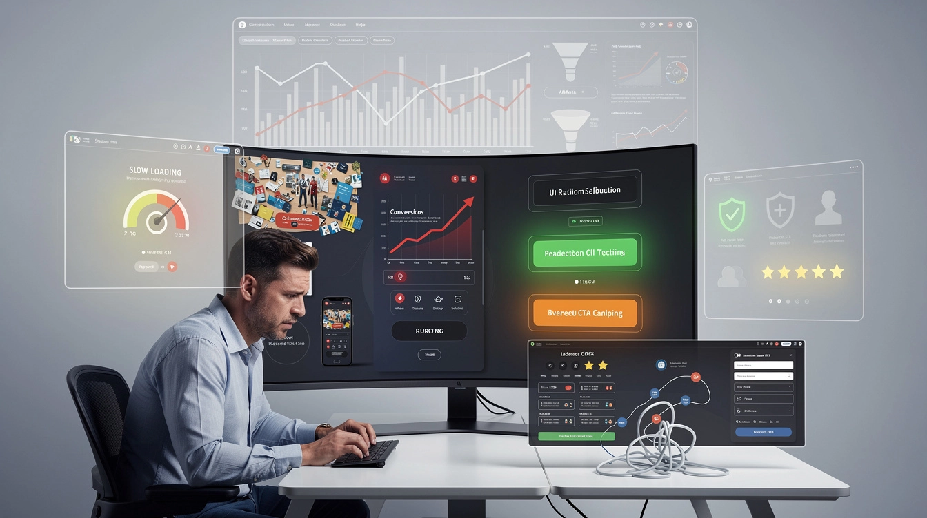
Poor website navigation architecture and UX design flaws
Website navigation serves as the digital equivalent of a store’s layout, guiding customers toward their desired destinations while encouraging exploration of additional offerings. When navigation architecture fails, visitors become lost, frustrated, and ultimately abandon their journey before reaching conversion points. The foundation of effective conversion optimisation rests upon creating intuitive pathways that eliminate confusion and reduce cognitive load for users attempting to complete specific actions.
User experience design encompasses far more than aesthetic considerations, extending into the realm of psychological understanding and behavioural prediction. Every element on a website should serve a specific purpose in guiding visitors toward conversion goals, whether that involves making a purchase, subscribing to a newsletter, or completing a contact form. Poor UX design creates barriers that prevent users from achieving their objectives, regardless of how compelling your offer might be.
Cluttered homepage layout reducing Click-Through rates
Homepage clutter represents one of the most common conversion killers, overwhelming visitors with excessive information, competing visual elements, and unclear prioritisation of content. When faced with too many choices or confusing layouts, users experience decision paralysis that leads to immediate abandonment rather than deeper engagement. Effective homepage design focuses on singular objectives, presenting clear value propositions while maintaining sufficient white space to allow important elements to breathe and command attention.
The psychology of choice suggests that presenting too many options simultaneously reduces the likelihood of any single selection being made. Successful homepages guide visitors toward specific actions through strategic use of visual hierarchy, compelling headlines, and streamlined content presentation. Companies that simplify their homepage layouts typically observe immediate improvements in engagement metrics and subsequent conversion rates throughout their customer acquisition funnels.
Non-intuitive menu structure causing high bounce rates
Menu structure directly influences how quickly visitors can locate relevant information and progress toward conversion goals. Complex navigation systems with unclear labelling conventions force users to guess at content locations, creating frustration that often results in immediate site abandonment. Industry best practices suggest limiting primary navigation to seven or fewer main categories, ensuring that each category clearly communicates its contents through familiar terminology.
The three-click rule, while not an absolute requirement, provides valuable guidance for navigation design by suggesting that users should access any piece of information within three clicks from the homepage. When navigation requires excessive clicking or fails to provide clear paths toward desired content, bounce rates increase dramatically while conversion opportunities diminish. Regular user testing reveals navigation pain points that may not be obvious to internal teams familiar with the website structure.
Missing breadcrumb navigation impact on user journey
Breadcrumb navigation provides essential context for users exploring deeper pages within a website hierarchy, helping them understand their current location while offering easy pathways back to previous sections. The absence of breadcrumb trails particularly impacts e-commerce sites and content-heavy platforms where users frequently navigate between categories and product pages. Breadcrumbs reduce cognitive load by eliminating the need for users to remember their navigation history while exploring your site.
Search engine optimisation also benefits from properly implemented breadcrumb navigation, as these elements provide additional context for search crawlers attempting to understand site structure and content relationships. Users who feel oriented and confident in their ability to navigate freely demonstrate higher engagement levels and increased likelihood of completing desired actions. The implementation of breadcrumb navigation requires minimal technical resources while delivering measurable improvements in user experience metrics.
Mobile responsiveness issues affecting touch target accessibility
Mobile responsiveness extends beyond
Mobile responsiveness extends beyond simply resizing elements to fit smaller screens; it fundamentally affects how easily users can interact with your interface. Tiny touch targets, crowded links, and insufficient spacing between interactive elements lead to accidental taps, frustration, and eventual abandonment. Research from the Baymard Institute shows that mobile usability issues are a key driver of cart abandonment, particularly when users struggle to tap buttons or form fields accurately on smaller devices.
From a conversion perspective, ensuring adequate touch target accessibility means designing buttons and clickable areas with sufficient size and spacing, typically at least 44×44 pixels as recommended by major mobile platforms. Clear visual feedback on tap, generous padding, and avoiding interactive elements placed too close to the screen edges all contribute to smoother mobile sessions. When your mobile experience feels effortless, you reduce friction in the buying journey and remove a major marketing mistake that silently reduces conversion rates.
Weak call-to-action strategies and button optimisation
Even the most persuasive marketing campaign will underperform if your call-to-action strategy is weak. CTAs act as the bridge between interest and action, yet many brands treat them as an afterthought rather than a core conversion asset. Poorly written, badly placed, or visually camouflaged CTAs can lead to situations where users read your content, nod along in agreement, and then simply close the tab because they are unsure what to do next. Optimising CTA copy, design, and placement is therefore essential to improving conversion rates across landing pages, emails, and paid traffic funnels.
Effective CTA optimisation requires thinking beyond the button itself and considering the full micro-journey leading up to the click. The surrounding copy, perceived risk level, offer clarity, and visual hierarchy all influence whether a visitor feels confident committing to the next step. By systematically testing and refining your call-to-action strategy, you create a more predictable pathway from visitor engagement to measurable business outcomes.
Generic CTA copy versus action-oriented microcopy
One of the most common marketing mistakes is relying on vague, generic CTA labels such as “Submit”, “Click here”, or “Learn more”. These phrases fail to communicate value or set expectations, leaving users uncertain about what precisely will happen after they click. In contrast, action-oriented microcopy describes the specific benefit or outcome awaiting the visitor, turning the CTA into a mini value proposition. For example, “Get my free audit”, “Download the pricing guide”, or “Schedule my strategy call” clarify both the action and the reward.
Actionable CTA copy also taps into behavioural psychology by reducing anxiety and emphasising positive outcomes. Phrases that use first-person language (“Start my free trial”) often outperform third-person versions because they feel more personal and empowering. When you treat every CTA label as a high-impact conversion lever rather than a design afterthought, you can transform existing traffic into more leads and sales without increasing ad spend or content output.
Poor button colour contrast and visual hierarchy
CTAs that visually blend into the surrounding layout are effectively invisible, even if the copy is strong. Low contrast buttons, muted colours that match body text, or links styled identically to navigation items all reduce the likelihood of clicks. Conversion-focused design typically relies on a primary accent colour reserved for key actions, supported by adequate contrast ratios for accessibility. This ensures that your most important buttons stand out at a glance, even for users skimming quickly or viewing your site in bright mobile environments.
Visual hierarchy extends beyond colour choice to include size, shape, and whitespace. A primary CTA should be more prominent than secondary options, with sufficient padding and margin to avoid visual clutter. Think of your button as the “hero” of the section: if a user were to glance at the screen for one second, would their eye be drawn immediately to the desired action? If not, there is likely an issue with hierarchy that is quietly undermining your conversion rate.
Above-the-fold CTA placement and heatmap analysis
Placing a single CTA only at the bottom of a long page assumes that most users will read every word before deciding to act, which rarely reflects real behaviour. Eye-tracking and scroll-depth studies consistently show that a significant share of visitors never reach the page footer, particularly on mobile. Including a clear, contextually relevant CTA above the fold gives motivated visitors an immediate next step, while additional CTAs later in the content support those who need more information before converting.
Heatmap and scrollmap tools offer invaluable insight into how users interact with your pages in practice. By reviewing where attention clusters, how far people scroll, and which elements receive the most clicks, you can refine CTA placement based on real user behaviour rather than guesswork. For example, you might discover that a CTA placed just after a compelling testimonial performs better than one buried in the closing paragraph. Systematically aligning CTA locations with engagement hotspots is a powerful way to turn passive interest into measurable conversions.
Multiple CTA confusion and decision paralysis
While offering options can sometimes be helpful, presenting too many CTAs on a single page often leads to confusion and decision paralysis. When visitors are simultaneously asked to “Book a demo”, “Download the guide”, “Join the newsletter”, and “Start a free trial”, they struggle to determine which action matters most. This cognitive overload leads many to choose the easiest option of all: doing nothing and leaving the site. Every high-converting page should have one primary CTA, with any secondary actions clearly positioned as supportive rather than competing choices.
Think of CTAs as directional signs on a motorway. If every sign points in a different direction with equal emphasis, drivers are likely to slow down or exit altogether. By defining a single, dominant goal for each landing page and ensuring design supports that hierarchy, you reduce friction and make it easier for users to move forward. This strategic prioritisation is especially important on mobile where screen real estate is limited and competing elements quickly become overwhelming.
Landing page speed optimisation and core web vitals
Page load speed remains one of the most underappreciated drivers of conversion performance. Multiple studies have shown that even a one-second delay in load time can reduce conversions by up to 7%, with abandonment rates rising sharply beyond the three-second mark. Slow landing pages magnify the cost of every paid click, as a significant portion of visitors leave before they even see your offer. In an environment where customer acquisition costs are steadily increasing, failing to prioritise speed optimisation is equivalent to pouring budget into a leaky bucket.
Google’s Core Web Vitals—Largest Contentful Paint (LCP), First Input Delay (FID, now part of Interaction to Next Paint), and Cumulative Layout Shift (CLS)—provide a practical framework for improving both user experience and organic visibility. Optimising for these metrics typically involves compressing and properly sizing images, implementing efficient caching, reducing render-blocking JavaScript and CSS, and leveraging content delivery networks for global audiences. Regular performance audits using tools such as PageSpeed Insights, Lighthouse, or WebPageTest allow you to identify bottlenecks and track improvements over time.
From a marketing perspective, faster landing pages do more than please search algorithms; they directly improve the effectiveness of campaigns across channels. Email subscribers are more likely to engage with offers that load instantly, social media visitors are less likely to bounce, and paid search traffic converts at a higher rate when the post-click experience feels snappy. Treating speed optimisation as a core component of conversion rate optimisation, rather than a purely technical concern, can unlock significant incremental revenue from the traffic you already have.
Trust signal implementation and social proof deficiency
In a digital environment saturated with scams, misleading offers, and low-quality products, trust has become a critical currency in conversion optimisation. Visitors may be interested in your product or service, but if they harbour doubts about security, legitimacy, or reliability, they will hesitate to take the final step. Missing or weak trust signals send subtle but powerful negative cues that undermine the effectiveness of even the most sophisticated marketing funnels. Addressing these gaps is essential for reducing perceived risk and increasing your website conversion rate.
Trust signals take many forms, including visible security measures, third-party endorsements, social proof, and transparent business information. The goal is not to overwhelm the interface with badges and logos, but to strategically reassure visitors at the exact points where anxiety tends to spike—most notably during checkout, lead capture, or when submitting sensitive information. By aligning trust elements with user concerns, you remove psychological roadblocks that silently depress conversions.
Missing security badges and SSL certificate display
One of the quickest ways to lose a potential customer is to present a checkout or lead form that does not clearly appear secure. While modern browsers display SSL indicators, many users are still conditioned to look for familiar trust cues such as padlock icons, “Secure checkout” labels, or short statements about encryption. When these are absent—or worse, when the browser signals “Not secure”—visitors rightly question whether their payment details or personal information could be compromised.
Implementing SSL across your entire site is now a baseline expectation, not a competitive advantage, yet reinforcing that security with simple visual indicators remains beneficial. Strategically placed microcopy, such as “Your payment details are encrypted and never stored on our servers”, can further reduce anxiety. The key is to make security both technically sound and visibly evident, particularly on high-intent pages where users are about to commit financially or share sensitive data.
Absent customer testimonials and review integration
Buyers often trust other customers more than they trust brands, which is why the absence of testimonials or reviews can significantly reduce conversion rates. When users cannot see evidence that others like them have successfully used your product or service, they are forced to take on more risk in their decision-making. This is especially damaging for higher-ticket purchases or unfamiliar brands, where social proof plays a decisive role in overcoming scepticism.
Integrating authentic customer testimonials, star ratings, and use-case stories throughout your site helps to validate your claims and demonstrate real-world outcomes. For e-commerce, displaying product reviews directly on product pages rather than hiding them behind separate tabs increases their impact. For B2B services, case studies that quantify results—such as “increased lead volume by 40%” or “reduced onboarding time by 30%”—provide concrete reassurance. When visitors see that others have achieved the results they want, they are far more likely to convert.
Lack of trust seals from norton, McAfee, and trustpilot
Third-party trust seals and review platforms function like digital references, signalling that an external authority has vetted your security, service quality, or customer satisfaction. While their effectiveness can vary by audience and context, studies have shown that recognised logos from providers like Norton, McAfee, or Trustpilot can meaningfully boost perceived credibility. The absence of any external validation, on the other hand, may cause visitors to pause—especially when competitors prominently display such endorsements.
It is important, however, to use trust seals thoughtfully rather than plastering them indiscriminately across every page. Placing security logos near payment forms, review badges near testimonials, and rating widgets in the footer or on key landing pages ensures relevance without clutter. Regularly updating these elements to reflect current certifications and accurate review scores also matters; outdated badges or obviously inflated ratings can backfire and erode trust instead of strengthening it.
Contact information transparency and business verification
A surprisingly common mistake in marketing is hiding or minimising contact information, whether intentionally or through poor design choices. When users cannot easily find a physical address, phone number, or legitimate email contact, they may question whether there is a real organisation behind the website. This lack of transparency is particularly damaging on high-consideration purchases, subscription services, or B2B offerings where long-term relationships are expected.
Prominently displaying contact details, office locations, and where relevant, company registration numbers or VAT information can significantly increase confidence. Including an “About” page with leadership profiles, brand story, and photos of real team members further humanises the business and reinforces legitimacy. From a conversion standpoint, the message you want to send is simple: if something goes wrong, there is a real, reachable team standing behind the product—and that assurance often makes the difference between a bounce and a completed transaction.
Form design complexity and checkout process friction
Forms and checkout flows are the final gateways between interest and revenue, yet they are also where a disproportionate amount of friction tends to accumulate. Overly long forms, confusing layouts, mandatory account creation, and limited payment options all contribute to abandonment at the most critical stage of the customer journey. When marketing and product teams focus solely on driving traffic without optimising these final steps, they leave substantial revenue on the table.
Reducing form and checkout friction is about more than simply removing fields; it involves aligning the information you request with the perceived value of the offer. Users are generally willing to share more data when they understand why it is needed and what they will receive in return. Clear progress indicators, inline validation, and helpful error messages also play crucial roles in keeping users moving forward rather than dropping out in frustration.
Excessive form fields and progressive profiling implementation
Every additional field in a form introduces a moment of resistance, causing users to ask themselves whether the effort is worth the outcome. Long, intrusive forms for low-value offers—such as asking for phone number, company size, and job title just to download a simple checklist—frequently result in abandonment. Data from various CRO studies suggests that reducing form fields can increase completion rates by 10–30%, depending on the starting point and audience.
Progressive profiling offers a more user-friendly alternative by collecting information gradually over multiple interactions rather than all at once. For example, you might ask for only name and email on the first conversion, then request role or company information when the user later signs up for a webinar or trial. This approach respects user time, reduces initial friction, and still provides your marketing team with rich data over the long term. The guiding principle is simple: request only the information that is essential for delivering the promised value at that moment.
Multi-step checkout versus single-page conversion funnels
Debate often arises around whether single-page or multi-step checkouts convert better, but the real issue is alignment with user expectations and product complexity. Single-page checkouts can feel faster and more transparent because all steps are visible at once, which is ideal for simple consumer purchases. However, cramming too many form fields into a single, cluttered page can have the opposite effect, overwhelming visitors and increasing error rates.
Multi-step checkouts, when designed well, break the process into manageable chunks and provide clear progress indicators (“Step 2 of 3: Shipping details”). This can reduce perceived effort and keep users engaged, particularly for higher-value or more complex orders that naturally require more information. A data-driven approach—testing both formats with your specific audience and products—is essential to determine which structure minimises abandonment. Whichever model you choose, the key is clarity: users should always know where they are in the process and what comes next.
Guest checkout options and account creation barriers
Forcing users to create an account before purchasing remains one of the most common and damaging checkout mistakes. Many visitors, especially first-time buyers, are not prepared to commit to a long-term relationship and simply want to complete a one-off transaction. When you demand account creation too early, they perceive unnecessary friction and may abandon the cart in favour of a competitor who offers a faster, more anonymous path to purchase.
Offering a guest checkout option significantly reduces this barrier while still allowing you to invite customers to create an account after the purchase, when trust and satisfaction are higher. You can even streamline this step by pre-filling details from the order and framing account creation as a convenience (“Save your details for faster checkout next time”). By respecting user preferences and timing the account request appropriately, you convert more visitors now while still nurturing long-term loyalty.
Payment gateway integration and alternative payment methods
Even when users are ready to buy, limited or unreliable payment options can abruptly halt the conversion process. If your checkout only supports a narrow set of cards, lacks local payment methods, or experiences frequent gateway errors, frustrated customers will quickly seek alternatives. This issue is particularly acute for international audiences, who may rely on region-specific solutions such as iDEAL, Klarna, or local digital wallets.
Expanding your payment options to include major cards, PayPal, digital wallets like Apple Pay or Google Pay, and relevant “buy now, pay later” services can materially improve completion rates. Equally important is ensuring that payment forms are optimised for mobile, with auto-filled fields, clear error handling, and minimal typing. Regularly monitoring payment failure rates and error logs helps you catch integration issues early, before they significantly impact revenue. In short, the easier you make it to pay, the more of your marketing investment will convert into actual income.
A/B testing methodology and conversion rate analytics
Without a structured A/B testing methodology, most conversion improvements remain speculative, guided by opinion rather than evidence. Well-intentioned redesigns and “best practice” changes can sometimes decrease conversion rates, even when they look more modern or polished. Systematic testing allows you to validate assumptions, identify what genuinely resonates with your audience, and continuously compound small wins into substantial performance gains over time.
Effective A/B testing begins with clear hypotheses grounded in user research and analytics, not random ideas. For example, if heatmaps show low engagement with a long-form page, you might hypothesise that simplifying the layout and elevating a primary CTA will increase click-through rate. Experiments should be run long enough to achieve statistical significance, with consistent traffic sources and controlled variables to avoid misleading results. Documenting each test, outcome, and learning creates an institutional knowledge base that informs future optimisation work across teams.
Conversion rate analytics underpin this entire process by revealing where users drop off, which campaigns drive the highest-quality traffic, and how different segments behave. Tracking micro-conversions—such as video plays, scroll depth, or add-to-cart events—alongside macro-conversions like purchases or lead submissions provides a more nuanced view of funnel performance. By integrating tools such as Google Analytics, product analytics platforms, and session recording software, you gain a comprehensive picture of the user journey. This data-driven approach ensures that improvements are not based on guesswork, but on measurable, repeatable results that directly address the marketing mistakes currently reducing your conversion rates.