# Creating a Memorable Brand Experience Across Touchpoints
In an age where consumers interact with brands through dozens of channels daily, the difference between a forgettable transaction and a lasting relationship often comes down to one critical factor: consistency. Every email, store visit, social media post, and product unboxing contributes to a cumulative impression that shapes how customers perceive your brand. When these interactions feel disjointed or contradictory, trust erodes quickly. When they harmonize into a cohesive narrative, however, they create the kind of memorable brand experience that transforms casual buyers into devoted advocates.
The challenge facing modern businesses isn’t merely creating individual moments of excellence—it’s orchestrating an entire ecosystem of touchpoints that work together seamlessly. Whether someone encounters your brand through a Google search, a physical store, or a customer service call, the experience should feel distinctly, recognizably yours. This level of consistency doesn’t happen by accident; it requires strategic planning, meticulous execution, and ongoing refinement across every channel where your brand appears.
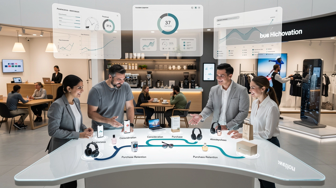
Mapping the customer journey to identify critical brand touchpoints
Before you can create a consistent brand experience, you need to understand precisely where and how customers encounter your brand. Journey mapping provides this clarity by visualizing every interaction from initial awareness through post-purchase advocacy. This process reveals not only the obvious touchpoints like your website or retail locations, but also the subtle moments—a Google review, an unboxing video, a follow-up email—that collectively shape perception.
Effective journey mapping begins with research, not assumptions. Customer interviews, analytics data, and behavioural studies reveal the actual paths people take, which often differ dramatically from the routes brands imagine. A fashion retailer might assume customers discover products through Instagram, when in reality, many first encounters happen through Pinterest searches or influencer recommendations. These insights fundamentally change where you invest resources to strengthen your brand presence.
Pre-purchase awareness stage touchpoint analysis
The awareness stage represents your brand’s first opportunity to make an impression, yet many businesses underestimate its importance. During this phase, potential customers encounter your brand through search results, social media posts, advertisements, PR coverage, or word-of-mouth recommendations. Each of these touchpoints must immediately communicate your brand’s essence—what you stand for, what makes you different, and why someone should care.
Search engine results pages exemplify the importance of this stage. Your meta descriptions, title tags, and featured snippets might be someone’s very first exposure to your brand. Do these elements reflect your brand voice? Do they communicate value clearly? Similarly, social media profiles serve as digital storefronts where first impressions form in seconds. Profile images, bio text, pinned posts, and visual aesthetics all contribute to that crucial initial perception.
According to recent research, 73% of consumers interact with multiple touchpoints before making a purchase decision, with the awareness stage accounting for the majority of these interactions. This statistic underscores why consistency at this stage matters so profoundly—you’re establishing the baseline against which all future interactions will be measured.
Consideration phase interaction mapping
Once awareness is established, potential customers enter the consideration phase, where they actively evaluate whether your brand meets their needs. This stage typically involves deeper engagement with your content: reading product descriptions, watching demonstration videos, comparing prices, reading reviews, or visiting physical locations. The touchpoints during consideration must build on the initial impression while providing substantive information that helps customers make confident decisions.
Your website becomes particularly critical during consideration. Navigation structures, product photography, copy quality, technical specifications, and user-generated content all influence whether someone moves forward or abandons their research. Interestingly, 88% of consumers conduct online research before making in-store purchases, meaning your digital touchpoints directly impact physical retail outcomes.
Email marketing also plays a significant role during consideration. Abandoned cart reminders, product recommendation emails, and educational content nurture prospects by maintaining engagement without being pushy. The tone of these communications matters enormously—are you helpful or desperate? Informative or salesy? These subtle distinctions shape whether customers perceive your brand as trustworthy or opportunistic.
Purchase decision moment of truth identification
The purchase moment represents a convergence of all previous touchpoints into a single
decision—what many brands call the “moment of truth.” At this point, even minor friction or inconsistency can derail the sale. Slow-loading checkout pages, confusing pricing, unexpected fees, or an unhelpful sales associate can undo all the goodwill built during awareness and consideration. Conversely, a streamlined, reassuring experience can turn hesitation into commitment.
To optimize this crucial touchpoint, scrutinize every step of the path to purchase. Is your checkout flow intuitive on both desktop and mobile? Are return policies, shipping costs, and delivery times clearly communicated before the final click? In physical environments, are payment options diverse and easy to use, and do staff members reinforce your value proposition rather than simply “processing” the transaction? Treat this stage like the climax of a story—everything should build towards a clear, satisfying resolution that feels aligned with your brand promise.
It’s also essential to design “save points” for when things go wrong. Proactive prompts when a payment fails, empathetic customer service scripts when stock is unavailable, and follow-up messages offering support after an abandoned checkout can recover lost sales. Brands that anticipate friction and respond with calm, human solutions signal reliability, which customers remember long after the transaction itself.
Post-purchase retention and advocacy touchpoints
Many organisations treat the sale as the finish line, but for memorable brand experiences, it’s just the beginning of a new phase: retention and advocacy. Post-purchase touchpoints—order confirmation emails, shipping notifications, unboxing, onboarding flows, loyalty programmes, and support interactions—either reinforce the wisdom of the customer’s decision or introduce doubt. This is where you transform one-time buyers into repeat customers and, ultimately, brand advocates.
Start with immediate post-purchase communications. Order confirmations and shipping updates should be clear, timely, and on-brand in both tone and design. Instead of generic transactional copy, use this space to reassure customers, set expectations, and offer simple next steps (such as how to track their order or access support). When the product arrives, the unboxing experience becomes a powerful physical touchpoint: thoughtful packaging, clear instructions, and small surprises like thank-you notes or samples make the experience feel intentional rather than purely functional.
Retention and advocacy also hinge on how you support customers after the initial excitement fades. Do you provide helpful tutorials, FAQs, or onboarding emails that help them extract full value from what they bought? Are loyalty rewards, referral programmes, and community spaces (like user groups or events) designed to feel like genuine appreciation rather than thinly veiled upsell attempts? When customers feel seen and supported over time, they’re far more likely to leave positive reviews, recommend you to others, and defend your brand when something occasionally goes wrong.
Orchestrating omnichannel brand consistency through visual and verbal identity systems
As customer journeys stretch across websites, apps, stores, events, and third-party marketplaces, achieving omnichannel brand consistency has become both more challenging and more critical. Visual and verbal identity systems provide the scaffolding that keeps your brand recognizable regardless of channel or device. Without clear standards, teams improvise, leading to a patchwork of experiences that confuse customers; with them, every touchpoint can sing from the same song sheet while still adapting to its specific context.
Think of your identity system as a toolkit rather than a straitjacket. It defines the core elements—logos, colours, typefaces, tone of voice, imagery style—that should remain stable, while also outlining where flexibility is allowed. This balance allows your brand to feel cohesive on everything from a billboard to a push notification, without feeling repetitive or forced. When executed well, customers should be able to recognise you even if your logo is temporarily absent.
Typography, colour palette and logo application standards
Typography, colour, and logo usage form the visual backbone of your brand experience. These elements should be codified in clear, accessible guidelines that explain not just what to use, but why and how. For example, defining primary and secondary typefaces, specifying sizes and line spacing for digital versus print, and establishing rules for headings, body copy, and calls to action all help designers and marketers maintain visual consistency across touchpoints.
Your colour palette should do more than look attractive; it should support usability and emotional resonance. Assign roles to each colour—primary brand colour, accent colours, background shades, and alert states—to ensure consistent application in interfaces, packaging, and marketing collateral. Accessibility is non-negotiable here: contrast ratios and legibility standards must be defined so your brand remains inclusive on all screens and in all environments.
Logo application standards round out this visual system. Detail minimum sizes, clear space requirements, acceptable backgrounds, and when to use different logo variations (full colour, monochrome, icon-only, stacked). Include examples of correct and incorrect usage so teams can spot issues quickly. When your logo appears predictably and cleanly across websites, social media, receipts, signage, and packaging, it reinforces trust and familiarity at every glance.
Tone of voice guidelines across digital and physical channels
Visual consistency is powerful, but without a coherent tone of voice, your brand can still feel fragmented. Tone of voice guidelines define how your brand “sounds” in emails, on product pages, in support scripts, and in-store signage. Are you formal or relaxed, witty or straightforward, bold or understated? Clarity here prevents whiplash-inducing shifts between chatty social posts and overly stiff legalistic emails.
Effective guidelines go beyond adjectives and include concrete writing principles. For instance, you might commit to plain language, short sentences, and active voice to keep communications accessible. You might specify how you express empathy in support contexts, how you handle apologies, and how you talk about pricing or limitations honestly. Including “before and after” copy examples gives teams a tangible sense of what on-brand and off-brand messaging look like.
Remember that tone should flex slightly by context without breaking character—just as you’d speak differently at a formal presentation versus a casual coffee, while still sounding like yourself. A brand might be more playful on social media and more measured in legal disclosures, but core traits such as respect, clarity, and authenticity should remain constant. When customers encounter a familiar voice across websites, chatbots, phone calls, and packaging, the brand feels more human and trustworthy.
Packaging design integration with in-store and e-commerce experiences
Packaging sits at the intersection of brand experience, product design, and logistics. It’s not only a protective shell; it’s often the first tangible manifestation of your brand that customers touch. To create a memorable brand experience across touchpoints, packaging design must align with both your in-store presentation and your e-commerce journey. If your online store promises minimalism and sustainability but customers receive an overstuffed, plastic-heavy parcel, the disconnect erodes credibility.
Start by ensuring your packaging reflects your visual identity: consistent colours, typography, logo placement, and imagery style. But go further and connect it back to the story told across channels. If your in-store displays emphasise craftsmanship, can your packaging include a brief origin story or maker’s note? If your social media highlights eco-consciousness, are your materials recycled or recyclable, and do you communicate that clearly on the box?
Packaging is also a bridge between offline and online experiences. QR codes linking to setup guides or community spaces, scannable loyalty IDs, and printed calls to action (“Share your unboxing with #YourBrand”) extend the moment into digital touchpoints. In physical retail, consistent shelf packaging and shopping bags reinforce the same look and feel shoppers saw online, reassuring them they’re in the right place and that the promise made online is being kept in-store.
Email marketing template alignment with brand architecture
Email remains one of the most controllable and measurable brand touchpoints—and one of the easiest to let drift off-brand. To avoid a fragmented inbox presence, design a set of email templates that align clearly with your brand architecture: one look and feel for transactional emails, another for promotional campaigns, another for lifecycle or onboarding sequences, all rooted in the same identity system. This helps subscribers quickly recognise the nature of each message while still knowing instantly who it’s from.
Visually, your templates should use your core typefaces, colour palette, and logo treatment in a way that’s optimised for readability across devices. Structurally, consistent header areas, footer layouts (including preference centres and legal information), and button styles reduce cognitive load for recipients. Copy-wise, apply your tone of voice guidelines so that order confirmations, newsletters, and re-engagement campaigns all sound like different chapters of the same brand story.
From a strategic perspective, map email touchpoints to specific stages of the customer journey. Welcome series support onboarding, win-back campaigns target lapsed customers, and VIP updates nurture your most engaged audience. When these flows are coherent in both design and voice, they reinforce the broader omnichannel experience rather than feeling like one-off blasts.
Leveraging sensory branding elements to create distinctive touchpoint experiences
While digital interactions dominate many journeys, our memories are still strongly shaped by multi-sensory experiences. Brands that deliberately design for sight, sound, scent, and touch create deeper emotional connections and more distinctive touchpoints. Think of sensory branding as moving from a flat, two-dimensional logo to a rich, immersive world customers can step into.
This doesn’t mean overwhelming people with stimuli at every turn. Instead, it’s about choosing a few sensory signatures that reinforce your positioning and applying them thoughtfully where they make sense. What should it feel like to walk into your store? What should customers hear when they interact with your app or open your product? By answering these questions intentionally, you craft experiences that stand out in a crowded marketplace.
Sonic branding and audio signatures in retail environments
Sonic branding is more than just picking a playlist; it’s the strategic use of sound to express your brand’s personality. From short audio logos at the start of a podcast ad to the ambient music in your retail locations, audio has a powerful, often subconscious impact on how customers feel. The right soundscape can make a space feel energetic, calming, premium, or playful—aligning the environment with your brand promise.
In retail environments, consider sound as part of the journey design. Does the music tempo match the desired browsing behaviour—lingering and discovering versus quick turn-and-go? Are volume levels comfortable for conversation? Could you incorporate subtle audio cues at key moments, such as a gentle chime when an order is ready for pickup or a distinctive sound when a loyalty app check-in is complete? These audio signatures become part of your brand’s mental real estate.
Digital channels also benefit from consistent sonic cues. App notification sounds, podcast intros, and video stings can share a common motif or rhythm so that, over time, customers recognise your brand with their eyes closed. The goal isn’t to be loud; it’s to be recognisable and appropriate for the context.
Olfactory marketing integration in physical spaces
Scent is closely linked to memory and emotion, which makes olfactory marketing a potent tool for physical brand touchpoints. Many hospitality, retail, and wellness brands deploy signature scents in lobbies, stores, and event spaces to create an immediate, visceral impression. When done well, this becomes a subtle anchor that customers associate with comfort, luxury, freshness, or whatever emotion your brand seeks to evoke.
To integrate scent thoughtfully, start with your brand positioning. A high-end spa might choose calming notes like lavender or sandalwood, while a tech-forward coworking space might opt for clean, citrusy profiles that suggest focus and energy. Consistency matters: the same or similar scent profile should greet visitors across locations so that the sensory association strengthens over time.
It’s also important to be considerate and inclusive. Overly strong or complex scents can be distracting or even trigger sensitivities. Work with specialists to calibrate intensity and distribution, and consider scent-free zones where appropriate. When balanced carefully, olfactory branding becomes a background layer that quietly reinforces your identity without drawing overt attention to itself.
Haptic design principles for product and packaging touchpoints
Touch is often overlooked in branding discussions, yet it’s central to how we judge quality. The weight of a device, the texture of a garment tag, the smoothness of a box lid—these haptic details all contribute to the perceived value of your brand. A flimsy-feeling product or creased, low-grade packaging can create a dissonance if your messaging claims premium status.
Haptic design begins with material choices. Are you using finishes, papers, and textiles that align with your positioning? A sustainable brand might prioritise recycled, uncoated papers with a natural feel, while a luxury cosmetics company might lean into soft-touch coatings and magnetic closures that create a satisfying “click” when closed. These tactile cues make using and handling your products feel like small rituals rather than mundane tasks.
Consider also the ergonomics of interaction. How easy is it to open your packaging without damaging it? Does the form factor of your product feel intuitive in the hand? Small touches—like embossed logos, textured grips, or pull-tabs that open smoothly—signal care and thoughtfulness. By designing for touch as well as sight, you make each physical interaction more memorable and aligned with your brand story.
Implementing customer experience management platforms for touchpoint orchestration
As the number of brand touchpoints grows, managing them manually becomes unsustainable. Customer experience management (CXM) platforms help centralise data, coordinate communications, and orchestrate journeys so that every interaction feels intentional rather than accidental. Instead of siloed email tools, ad platforms, and support systems, a CXM approach unifies these elements into a single view of the customer.
Implementing such a platform starts with clarifying your objectives. Do you want to personalise content across channels, reduce churn, or improve NPS scores? Once goals are defined, you can select a solution that integrates with your existing tech stack—CRM, e-commerce platform, marketing automation, and support tools—and begin mapping key customer segments and journeys within it. This allows you to trigger specific messages or actions based on behaviours, such as viewing a product, abandoning a cart, or reaching a loyalty milestone.
However, technology alone doesn’t guarantee a cohesive brand experience. You also need governance and collaboration. Who owns journey design? How do brand, marketing, product, and customer service teams coordinate within the platform? Establishing shared templates, approval workflows, and regular reviews ensures that automated journeys still feel human and on-brand. Over time, you can use the platform’s analytics to test hypotheses, refine messaging, and remove friction at scale.
Measuring brand experience effectiveness through touchpoint analytics and NPS methodology
Designing memorable brand experiences is only half the task; the other half is measuring whether they work. Touchpoint analytics and Net Promoter Score (NPS) methodology provide complementary lenses for understanding performance. Analytics reveal what customers do at each interaction, while NPS and related survey tools reveal how they feel about those experiences.
Begin by defining key performance indicators for your most important touchpoints. For digital experiences, this might include conversion rates, time on task, bounce rates, or support ticket volumes. For physical environments, dwell time, repeat visits, and in-store conversion become relevant. Rather than tracking every possible metric, focus on a handful that clearly map to business outcomes and brand experience quality.
NPS adds an emotional and relational dimension. By asking customers how likely they are to recommend your brand to others (on a scale of 0–10) at strategic moments—after a purchase, following a support interaction, or at key lifecycle milestones—you can gauge overall loyalty and identify promoters, passives, and detractors. Pairing NPS with open-ended follow-up questions (“What is the primary reason for your score?”) yields rich qualitative insights that highlight specific touchpoints delighting or disappointing customers.
The real power emerges when you combine behavioural data and sentiment. For instance, you might notice that customers who experience a particular onboarding flow not only activate faster but also give higher NPS scores. Or you may find that a certain support channel resolves issues quickly but leaves detractors feeling unheard. These insights guide prioritisation: you can invest in amplifying high-impact touchpoints and redesigning those that consistently underperform. Measurement then shifts from a one-time audit to an ongoing feedback loop.
Case studies: apple store genius bar, starbucks reserve roastery, and nike house of innovation touchpoint ecosystems
Some of the world’s most recognisable brands have built their reputations on meticulously designed touchpoint ecosystems. Examining how they orchestrate experiences across channels can offer practical inspiration for your own brand strategy. While you may not have their budgets, you can adapt their principles on a scale that fits your organisation.
Apple’s Genius Bar is a classic example of turning support into a signature brand experience. Rather than hiding technical help in a back room, Apple places the Genius Bar at the heart of its stores and treats it as a consultative, human-centred touchpoint. Customers book appointments via app or web (digital touchpoints), receive clear confirmations, and then engage with knowledgeable staff in a space that mirrors Apple’s minimalist design philosophy. The consistent visual language, calm tone, and hands-on support all reinforce Apple’s positioning as approachable, premium, and user-focused.
Starbucks Reserve Roasteries take the familiar coffee shop concept and elevate it into an immersive environment that showcases the brand’s craft credentials. From the smell of freshly roasted beans to the sound of baristas explaining brewing methods, every sense is engaged. Digital elements—like mobile ordering, loyalty programme integration, and AR experiences—extend the journey beyond the physical visit. Yet the core identity remains unmistakably Starbucks, thanks to consistent iconography, tone of voice, and hospitality style across locations.
Nike’s House of Innovation stores embody omnichannel integration at scale. Customers can browse curated product stories in-store, customise items on the spot, and use the Nike app to scan products, check sizes, and complete purchases without queuing. The same bold visual identity, motivational messaging, and performance-driven narrative flows from outdoor signage to digital displays to post-purchase emails. By aligning physical, digital, and service touchpoints around a clear brand promise—enabling athletes of all levels to reach their potential—Nike turns shopping into an experiential journey that feels cohesive, personal, and memorable.
What unites these examples is not just impressive design, but disciplined cohesion. Each brand has defined who it is, translated that identity into clear visual and verbal systems, and then applied those systems consistently across touchpoints while allowing for context-specific innovation. You can follow the same pattern: map your customer journey, choose the moments that matter most, and design them as interconnected chapters of a single, compelling brand story.